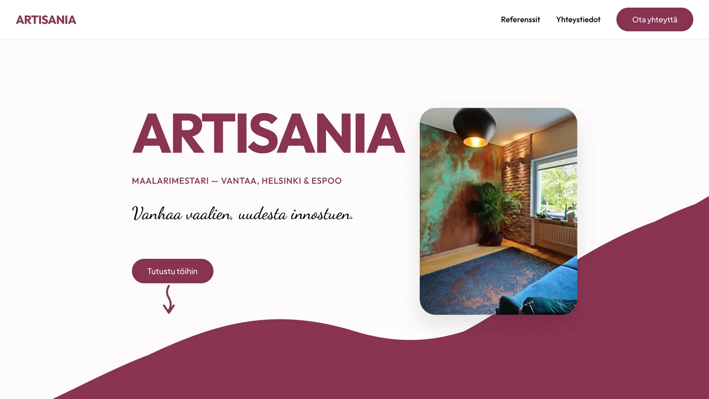
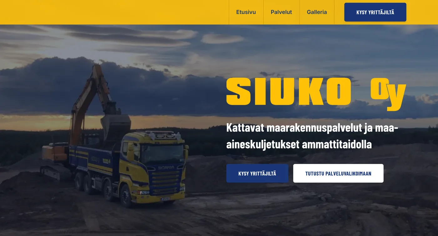
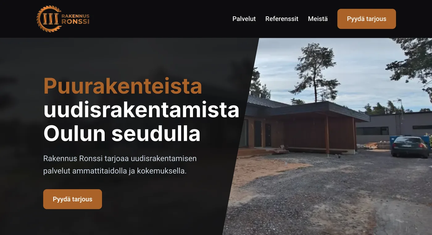
Not getting enough enquiries from your website? Check these 5 things
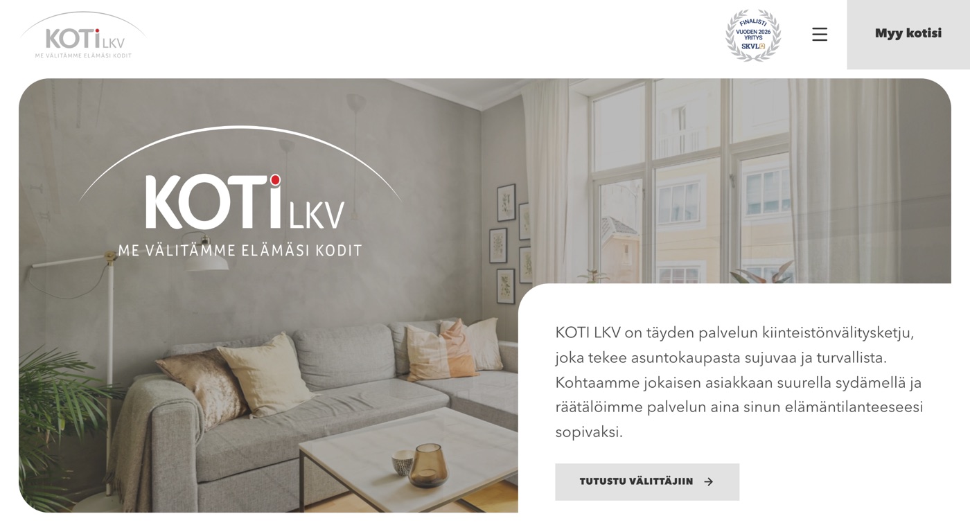
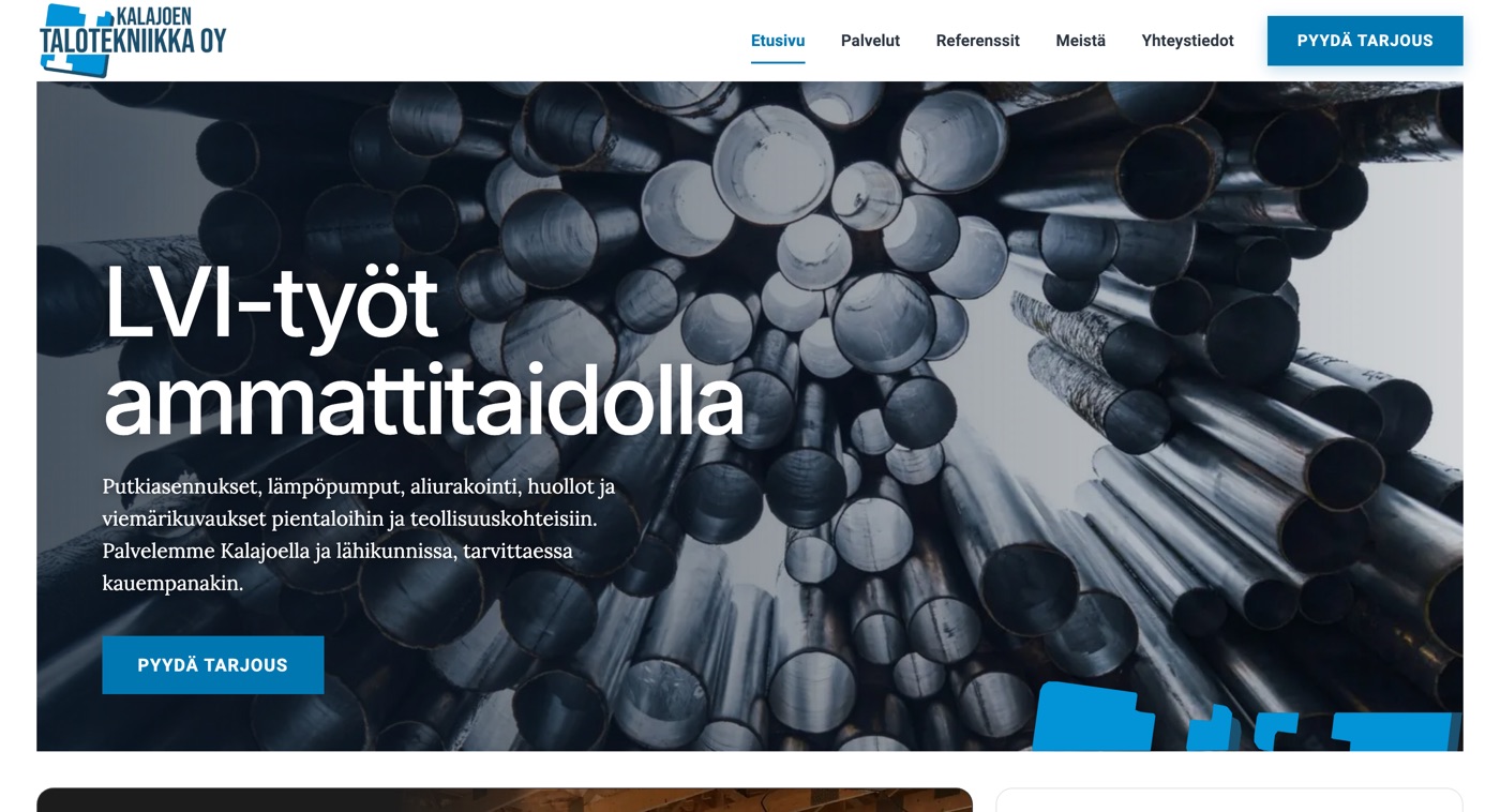
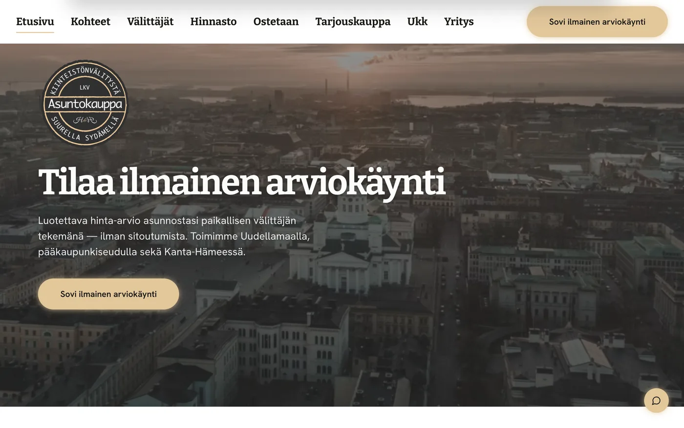
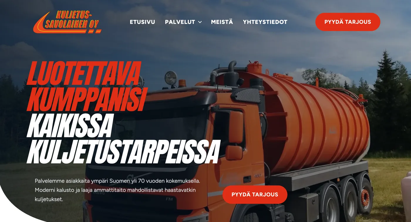
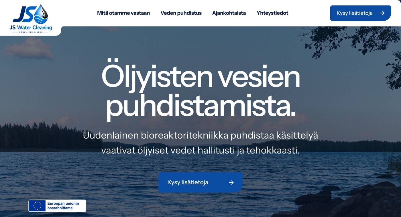
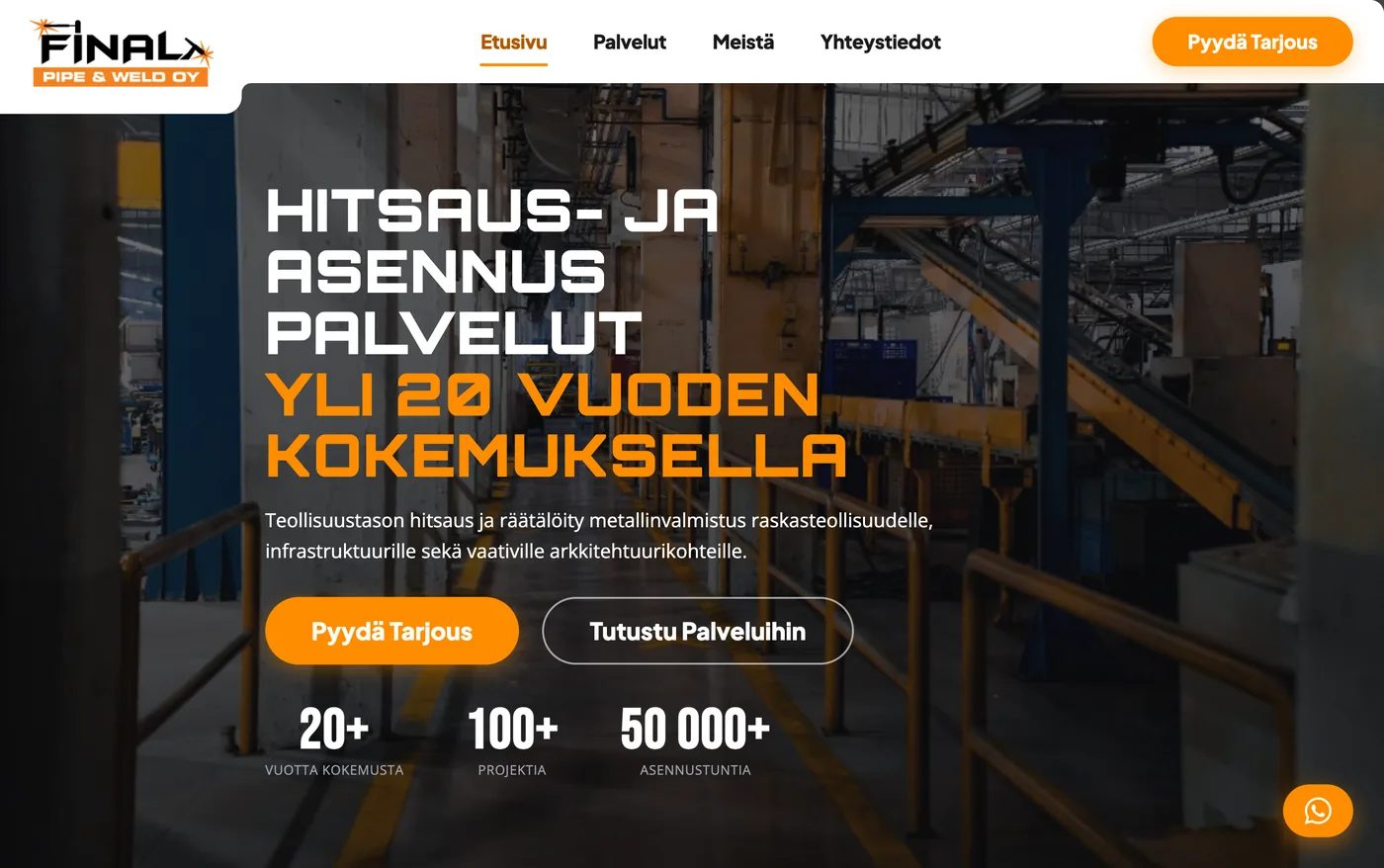
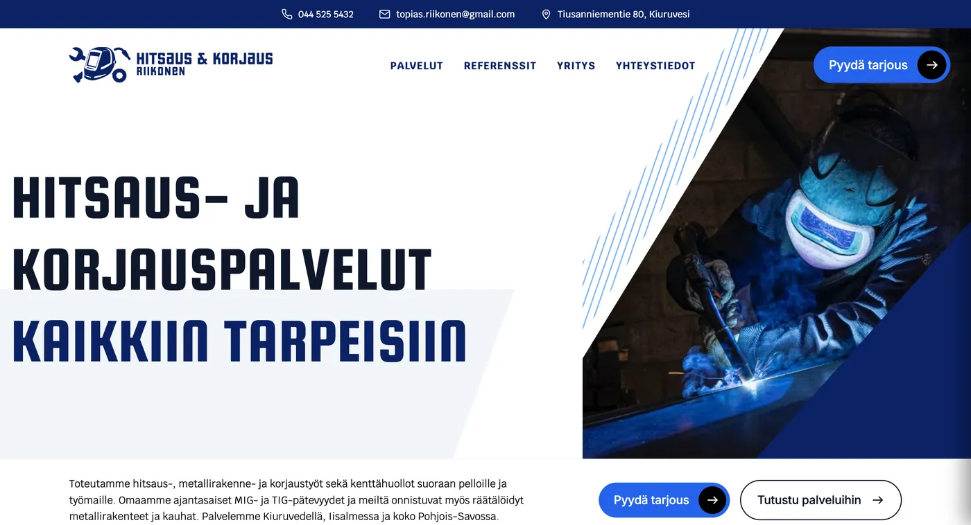
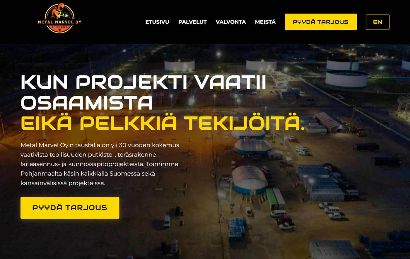
A website that generates enquiries has five essential elements: an opening section that immediately answers four basic questions, project examples and reviews shown before the services, the story and people behind the business, three clear ways to get in touch, and transparent prices or estimates that explain what the service includes.
A polished design alone is not enough if the site fails to address a buyer's doubts in the right order. Open your own website and check these five areas from top to bottom, following the same path as a first-time visitor.
| Section to check | The visitor's concern it should address | What the section should include |
|---|---|---|
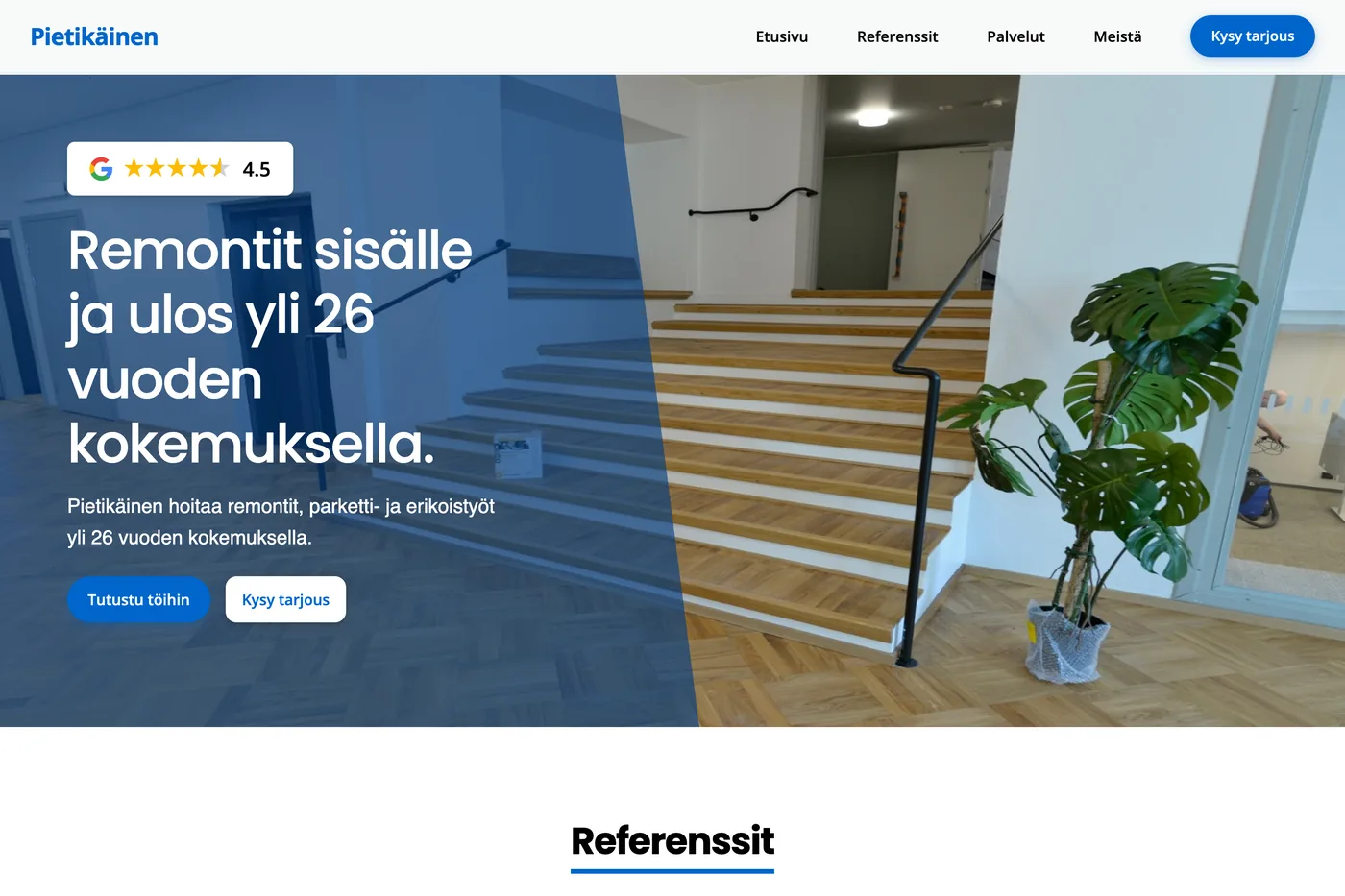
| 1. Opening section | "Is this company right for me, and what should I do next?" | A headline that promises a clear benefit, a clear call to action (CTA) and evidence that builds trust, such as a Google review rating. |
| 2. Project examples and testimonials (before services) | "Does this company know its work, and does it serve clients like me?" | Partner logos, completed projects and authentic client testimonials. |
| 3. The company's story and people | "Who is behind this company, and who will I be dealing with?" | Real faces, names and the company's story. |
| 4. Contact options | "How can I get in touch quickly in a way that suits me?" | A phone number, email address and short contact form. |
| 5. Clear pricing | "What does this cost, and what does the price include?" | Exact prices or estimates, with a clear explanation of what each service includes and excludes. |
1. Does your opening section answer four questions at a glance?
When someone arrives on a website, you have a second to make an impression. At a glance, the homepage's opening section should answer these four questions:
- What do you do?
- Who is it for?
- Why should I care?
- Where do I go next?
The opening section should build enough interest and trust for visitors to want to explore the rest of the page.
You build trust and interest by addressing a potential client's uncertainty. When visitors can see that the service is right for them and the next step is clear, they are more likely to continue.
In practice, your homepage should include:
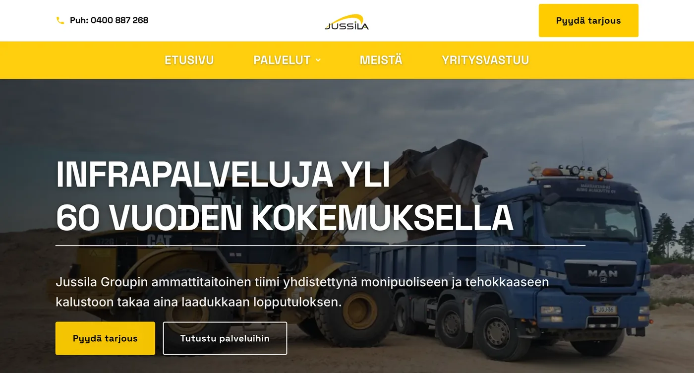
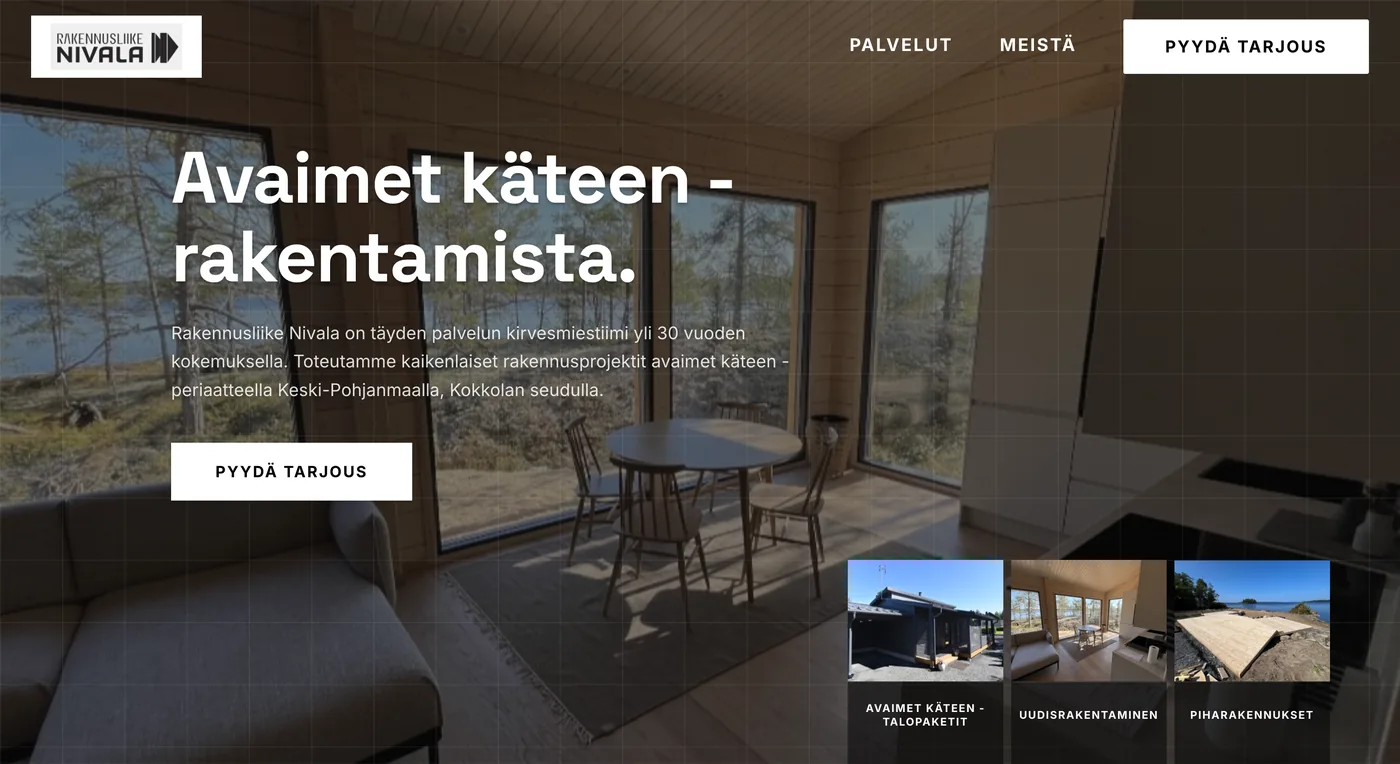
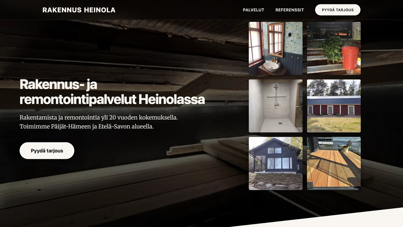
- A clear call to action. A call to action (CTA) should explain what happens when someone clicks and make the next step clear. For example, "Book a meeting" or "See the free demo" tells visitors what to expect.
- A headline that promises a benefit. Your main headline should tell visitors what they stand to gain. They already know whose website they are on. They want to know what you offer and which problem you solve.
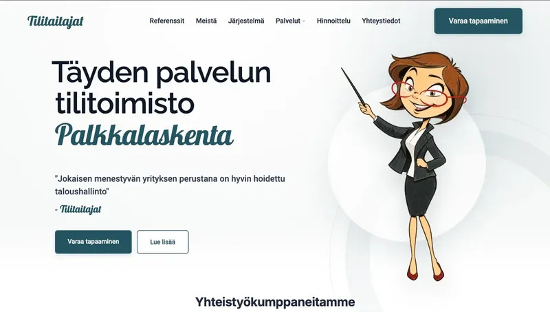
- Images, results or testimonials that build trust. These might include partner logos, Google reviews and an average rating such as 4.8 stars, measured results or evidence of extensive experience, all visible in the opening section. Visitors should be able to see immediately that they are dealing with an experienced professional.
2. Do you show project examples and testimonials before your services?
Project examples, partner logos and testimonials should appear near the top of the page, before the services section. A buyer's biggest worry is paying for a service that delivers no results or working with someone who does not understand their industry. Before reading your service descriptions, visitors look for evidence that you have successfully done similar work.
When you give visitors good reasons to trust your business at the top of the page, they are more receptive to the services that follow. Starting with a long list of services without evidence of completed work makes the page read like unsupported self-promotion.
In practice, show the following before your services:
- Partner logos directly below the opening section. A row of client and partner logos supports the Google review rating in your opening section and immediately shows that yours is an established, trusted business.
- Clearly presented project examples. For each project, show a genuine image of the work, the industry and what improved for the client. Seeing an example from their own industry and a real result, such as Metal Marvel Oy's website redesign reducing its bounce rate to around 25%, helps visitors see that they are in the right place.
- Testimonials with names. Testimonials should come from real people and include their names and company names. Seeing another business owner describe a successful collaboration makes it easier to request a quote.
3. Does your website show the real people and story behind your business?
Your website should show your company's story and the people behind it because clients buy from people. In the age of AI, putting a face to your business matters more than ever.
When requesting a quote, many business owners wonder who will actually do the work, who will answer the phone and whether they will be left to deal with problems alone. Showing the owner or team alongside your company's story helps build trust.
In practice, your company section should include:
- Real faces and names. Show photos, names and roles for the owner and key team members. Seeing the person who will answer the phone or attend the meeting makes getting in touch feel more comfortable.
- A clearly told company story. Explain briefly and honestly why your company exists, how you work, where you operate and what you promise clients. This does not need to be a long company history. Explain why clients can trust you to deliver.
- Genuine photos of your business at work. Replace staged stock photography with real images of your team, job sites, office or client meetings. Authentic photos help your business stand out.
4. Is it easy to get in touch in three different ways?
Your website needs a clear contact section and several ways to reach you because different clients get in touch in different situations. A phone number, email address and contact form cover most needs.
One common reason websites generate few enquiries is that contacting the business takes too much effort. A busy owner wants to call with one tap, a buyer at their desk wants to send an email, and someone browsing in the evening wants to leave a message through a short form.
In practice, your contact section should include:
- A phone number visitors can tap to call. Make the phone number a clickable link that starts a call on a phone, so visitors do not have to remember or copy it.
- An email address that is easy to find. Display your email address as text and as a link, so visitors can click it or copy it into their email app.
- A short, easy-to-complete contact form. Ask only for essential information: a name, phone number or email address, and a short message. Explain beside the form who will reply and how soon. For example, at Sivusuunta, we reply within 48 hours.
5. Are your prices and the scope of your services clear?
Clear website pricing makes it easier to get in touch because buyers want to understand the price range and service scope before contacting you. Exact prices or estimates, together with clear inclusions and exclusions, reduce guesswork and concerns about unexpected bills.
Many companies leave prices off their websites because they worry about putting clients off or because each project is different. In practice, hiding prices can drive away buyers who are comparing providers and need to know whether a service fits their budget. Even when the final price depends on the project, you can provide a starting price or typical range.
In practice, your pricing should include:
- Exact prices or clear estimates. If your service has a fixed price, state it clearly, as we explain in our guides to how much a business website costs and how much search engine optimisation costs. If the price depends on the scope, give an honest estimate or starting price and explain what affects the final cost.
- A clear explanation of what each service includes and excludes. For each service or package, explain which tasks, materials or deliverables are included and what costs extra. Setting clear expectations helps clients understand exactly what they are paying for.
- Clear VAT and payment information. Always state whether prices exclude VAT (+ VAT) or include it, and whether the payment is one-off, monthly or annual.
Did you find gaps in your own website?
If your opening section lacks a clear promise, your project examples are hard to find, visitors cannot see who is behind the business, contact options are difficult to use or prices are missing, the problem lies in the website's structure. At Sivusuunta, we design and build websites around these five elements, helping people find you through Google and AI search and guiding visitors towards getting in touch.
You can also see what you are buying and what it costs:
- See the price in advance. Our custom website packages cost from €550 + VAT as a one-off payment (Small, 1–3 pages, from €550 + VAT; Medium, 4–7 pages, from €1,200 + VAT; Large, 8+ pages, from €1,800 + VAT), and our one-page Small business website cost €370/year + VAT with no setup fee. You can find all prices in our website price list.
- The foundations for search visibility and tracking are included. With a new website, both the search engine optimisation starter package (normally €300 + VAT) and web analytics setup (normally €200 + VAT) are free.
- See a free demo before you decide. We create a free demo of your new homepage before you commit to anything. See how a benefit-led headline, trust-building elements and a clear call to action work with your own branding.
Sivusuunta's websites for businesses start with a free demo, so you can see a draft of your new site before making a decision.
Book a meetingFrequently asked questions about websites that generate enquiries
Why isn't my website generating enquiries even though it looks professional?
A professional design alone will not generate enquiries if the page fails to address visitors' doubts in the right order. Enquiries suffer when the opening section does not immediately explain what you offer, client work and testimonials are missing before the services section, visitors cannot see the people behind the business, or getting in touch is difficult.
Which four questions should the homepage's opening section answer?
At a glance, the opening section should answer four questions: what you do, who your service is for, why visitors should care and what they should do next. In practice, that means a headline that promises a clear benefit, a clear call to action (CTA) and evidence that builds trust, such as Google reviews or client logos.
Why should client work and testimonials appear before the services section?
Project examples, partner logos and testimonials address visitors' doubts before they explore your services. When visitors first see completed projects and satisfied clients, they approach the service descriptions with more confidence and are more likely to get in touch.
Why should a website show the people and story behind the business?
In the age of AI, anyone can create an anonymous website and generic sales copy in minutes. Showing real faces, names and your company's story helps visitors see that they are dealing with a real professional, building trust and encouraging enquiries.
Why does clear website pricing help generate more enquiries?
Clear pricing addresses a buyer's uncertainty before they contact you. Publishing exact prices or estimates and explaining what each service includes and excludes reduces concerns about hidden costs and makes getting in touch easier.
All prices exclude VAT.